

Bright Wall/Dark Room
Illustrations for written pieces in Bright Wall/Dark Room, “an independent online film journal devoted to exploring the relationship between movies and the business of being alive.”

Infinity Pool’s Travel Guide to the Death Drive
Written by Travis Woods
Digital Painting
The art director had requested this specific design which for a first assignment was a big sigh of relief. It was a challenge to get the feel of this mask’s likeness as well as making it look like a mask at all.
Written by Roxane Llanque
Digital Painting/Drawing
It’s not obvious how simple this drawing is. I used heavy amounts of graphical lines that make up most of the drawing. The painting is a secondary helper but together it balances between comic book style and realism. The only reason I mention this is because some people’s first reaction to this image is that it looks photographic. I found that odd. It does help that the source references were hard lit which helps with contrast and definition. I personally love this look and feel. I probably would do it this way on most projects if I can help it.

Written by Elizabeth Cantwell
Digital Painting
So this one was very challenging because I had to draw a blob-thing from eXistenZ. I kept it soft and simple at first. I was then asked to push it a bit further. So I pushed lines and shadows and … voila. it was particularly fun to design it like a print ad, the features of the MetaFlesh Game Pod being detailed in the panels.
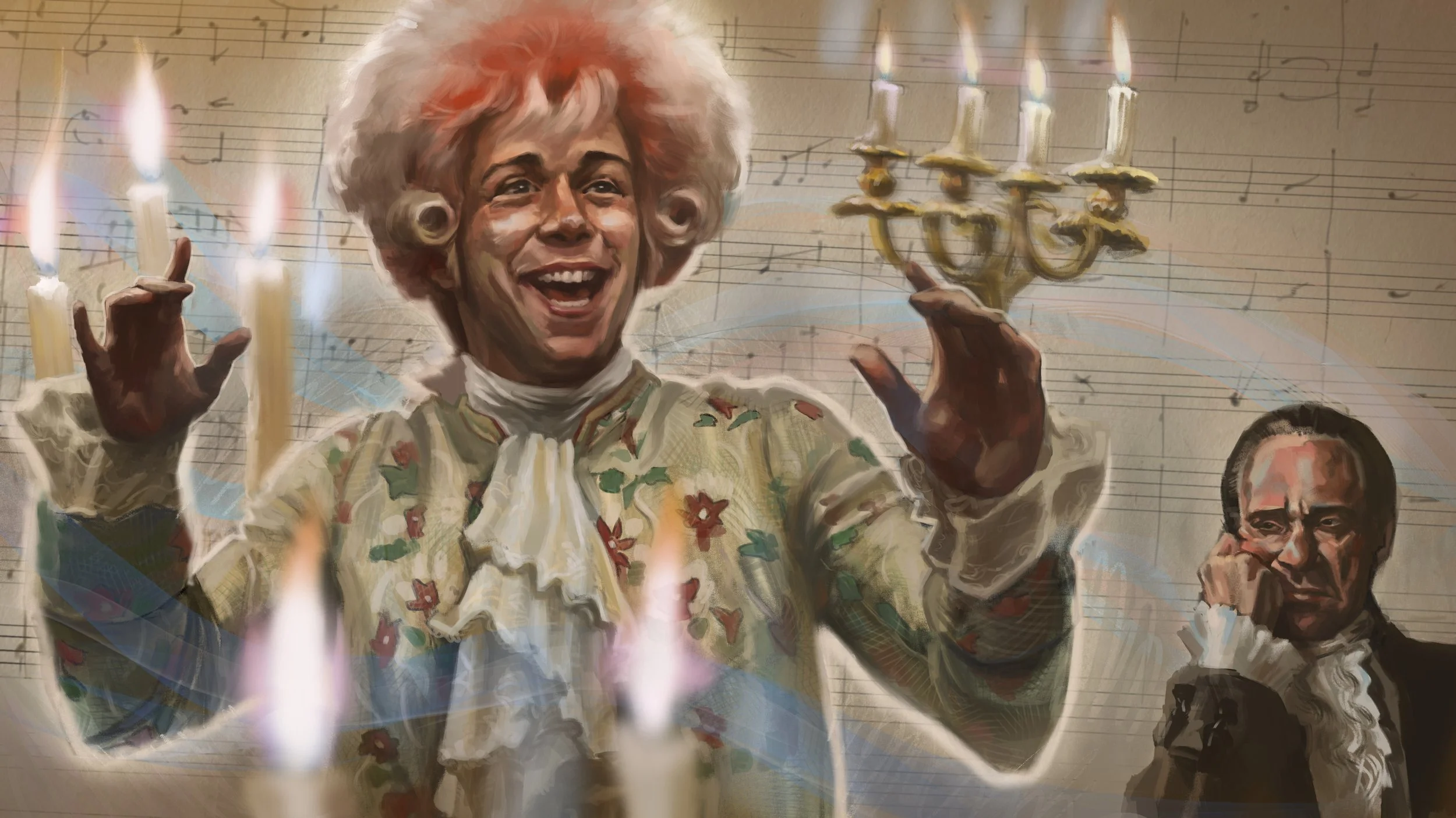
Written by Ethan Warren
Digital Painting
After sweating it out, eventually I got something that looks like Tom Hulce. It wasn’t so hard to nail down F. Murray Abraham’s Salieri. He has a well defined face. I added him as a rather on-the-nose manner in the corner to emphasize his silly behavior.

After Life: On Roger Corman and Frankstein Unbound
Written by Frank Falisi
Graphite Pencil on Toned 9 x 12 Paper.
Only a few rough drafts before properly executing it, it was good practice in composition visualization on physical media - especially when you have to deliver something. Traditional medium forces you to pre-plan and restrict your mark making down readable indications more than just noodling endlessly. There is limited time and space. Going larger would have presented a different problem.

Written by Frank Falisi
Digital Drawing
Although the assignments were always go for feel instead of the lifting scenes straight out of the movie, this particular shot in The Banshees of Inisherin was too good to not reference. The empty space on Padraic’s table was an opportunity to add plot elements in a humorous way. Colm passing by outside the window was not just an excuse to include the character but to amplify Padraic’s loneliness.

Digital Drawing
Drawing a flat piece of paper is not very intuitive. This design idea came directly from the art director. It was my job to add some flair to it. Oh I know, take a photo of a hundred dollar bill and light it at an angle to bring out all the crinkles to give it character and that’s about the only interesting contribution I made. And then I just slaved away trying to make the details work.

The Thin Man’s Thoroughly Modern Screwball Marriage
Written by Bryan Miller
Ink and Wash on Bristol Paper
How else to portray a black and white film than to draw it in black and white? And nothing is more fun than to hatch out lines that emulate golden age illustrator feel. I’ve made two failed attempts before I landed on this one and even then barely bringing this one together. Inking is just fickle I guess.
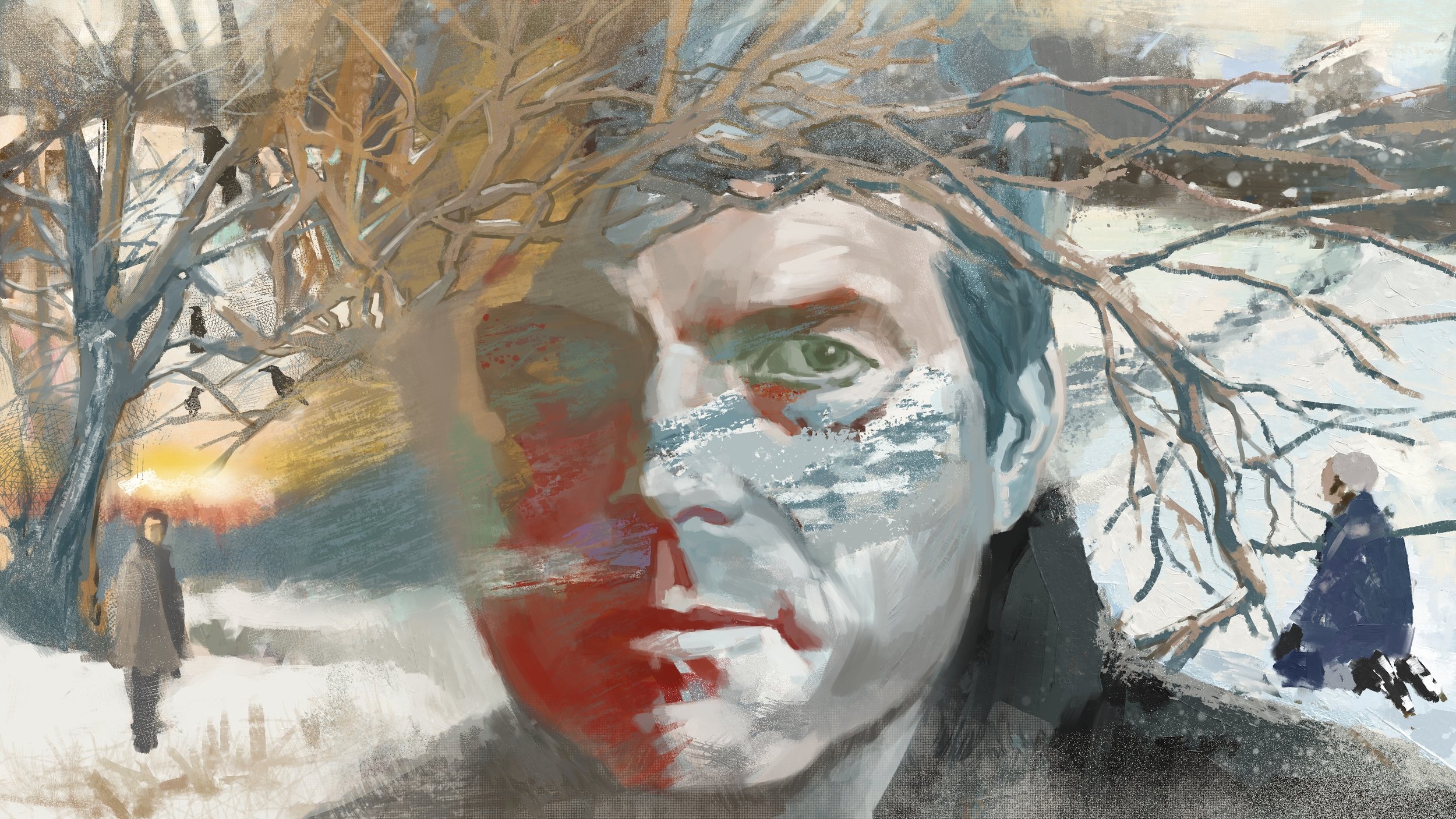
Written by Bryan Miller
Digital Painting
During this time, I was heavily studying the works of David Grove and wanted to try capturing his style. I wanted this picture to feel cold and blasted in snow with a hint of warm sun peeking at the horizon. That warm glow is present in all of Grove’s work but I definitely did not want to copy the mood verbatim. I’ve struggled with Bill Paxton’s likeness most of the time and haphazardly tried to bring these elements together. At the very least, this painting includes the psychological elements being explored in the movie.
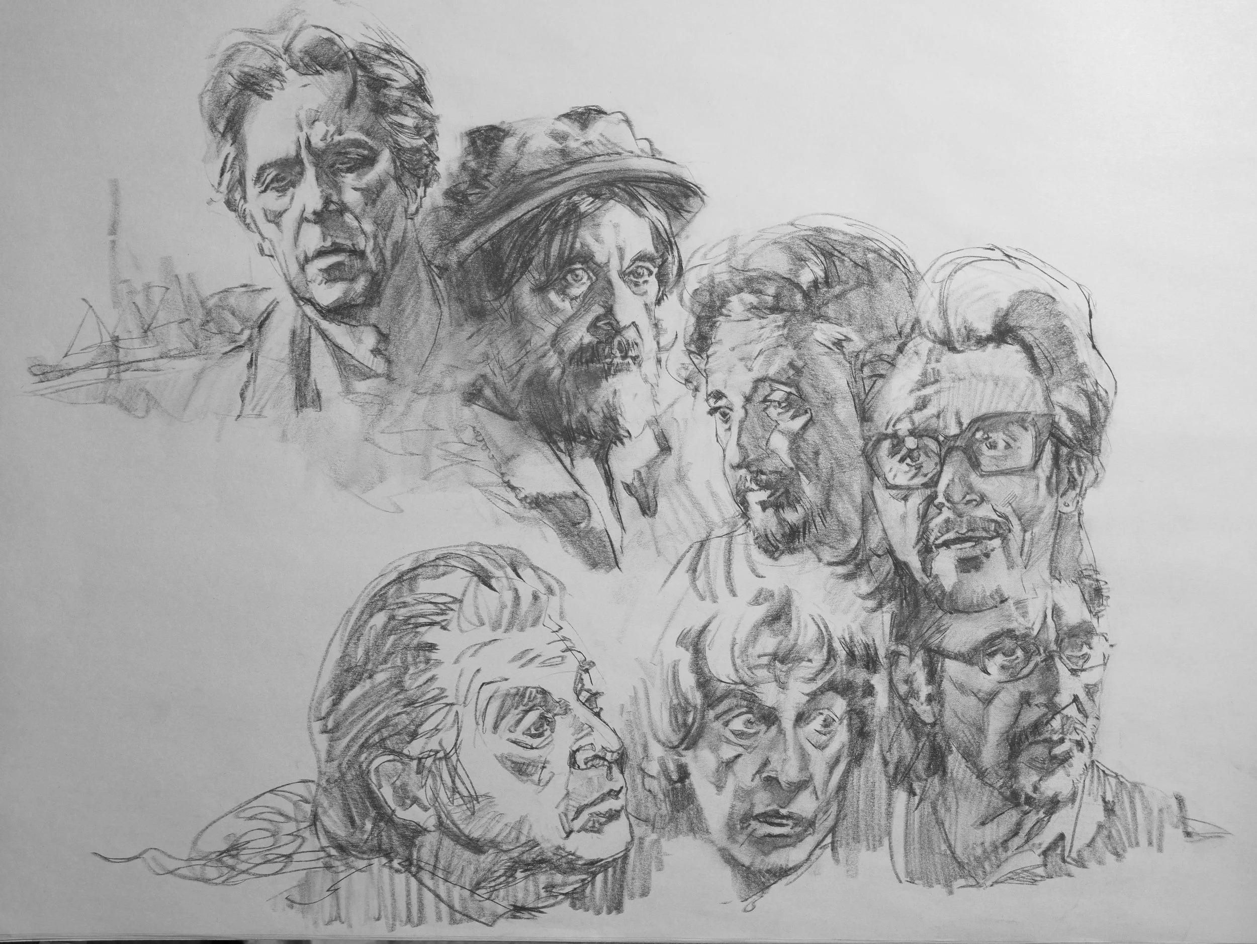
Written by Bryan Miller
Charcoal Pencil on Newsprint
This was just a session in practicing head portraits. Of course I would have had to watch all of Al Pacino’s later movies to look for the right expression. That’s how it is - sometimes the most time is spent on looking for something to draw.
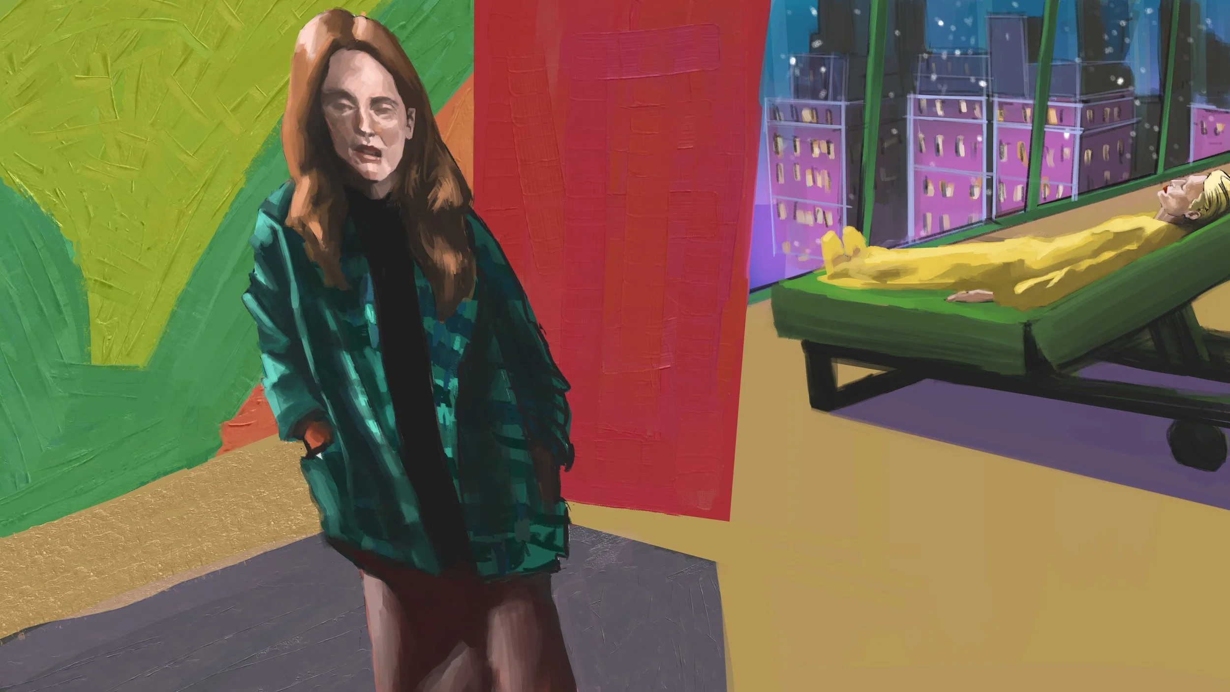
Written by Helena Fitzgerald
Digital Painting
While I was tempted to draw the two beautiful actresses in this movie, it was calling for abstraction. The film had a scene showcasing Edward Hopper’s painting so I ran with that. It was too tempting not to carry on with the theme as probably did the director. but my main goal was characterize the state of the mind and to evoke a sense of dreamlike melancholy.
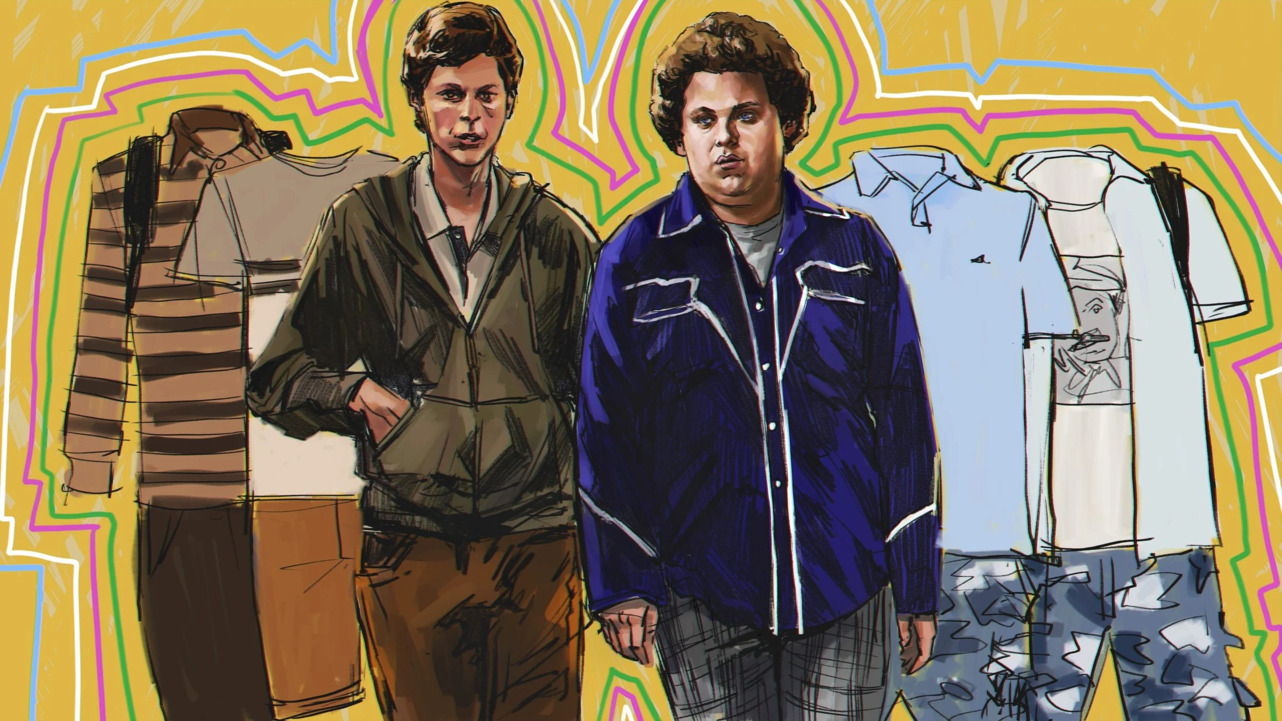
Written by Katherine Connell
Digital Drawing/Painting
I knew I had to draw some wardrobe selections and there is no wrong way to draw clothes. If you’re a clothing company, then you’ll want to bring as much detail and color into the product photo or even illustration if you’re talking about the late 70s and 80s advertisements. In this case, a simple drawing and base color works just fine. And it’s fun.

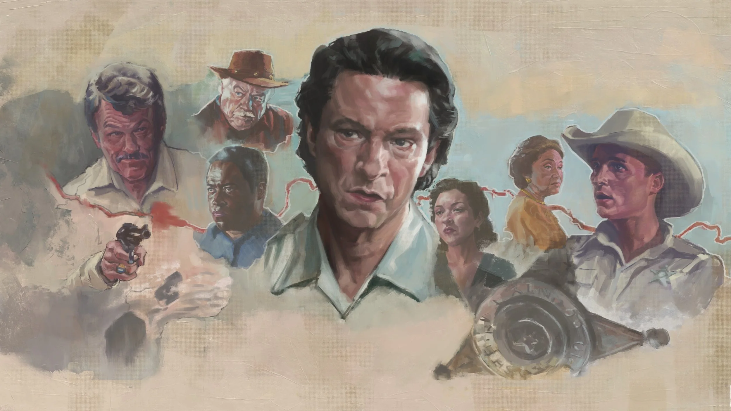
Can I Help You, Brother?
Written by Russell Nichols
Graphite Drawing on 14 x 17 Paper
I once again wanted that David Grove/Bernie Fuchs vignetted feel for this piece. Watching the movie, it had this very indie feel to it -just barely put together and very low budget. So I let that guide me. I could have gone full on value drawing and fill the page with dirty charcoal (or even paint) but I felt that would have given an unnecessary big feel to this humble film.
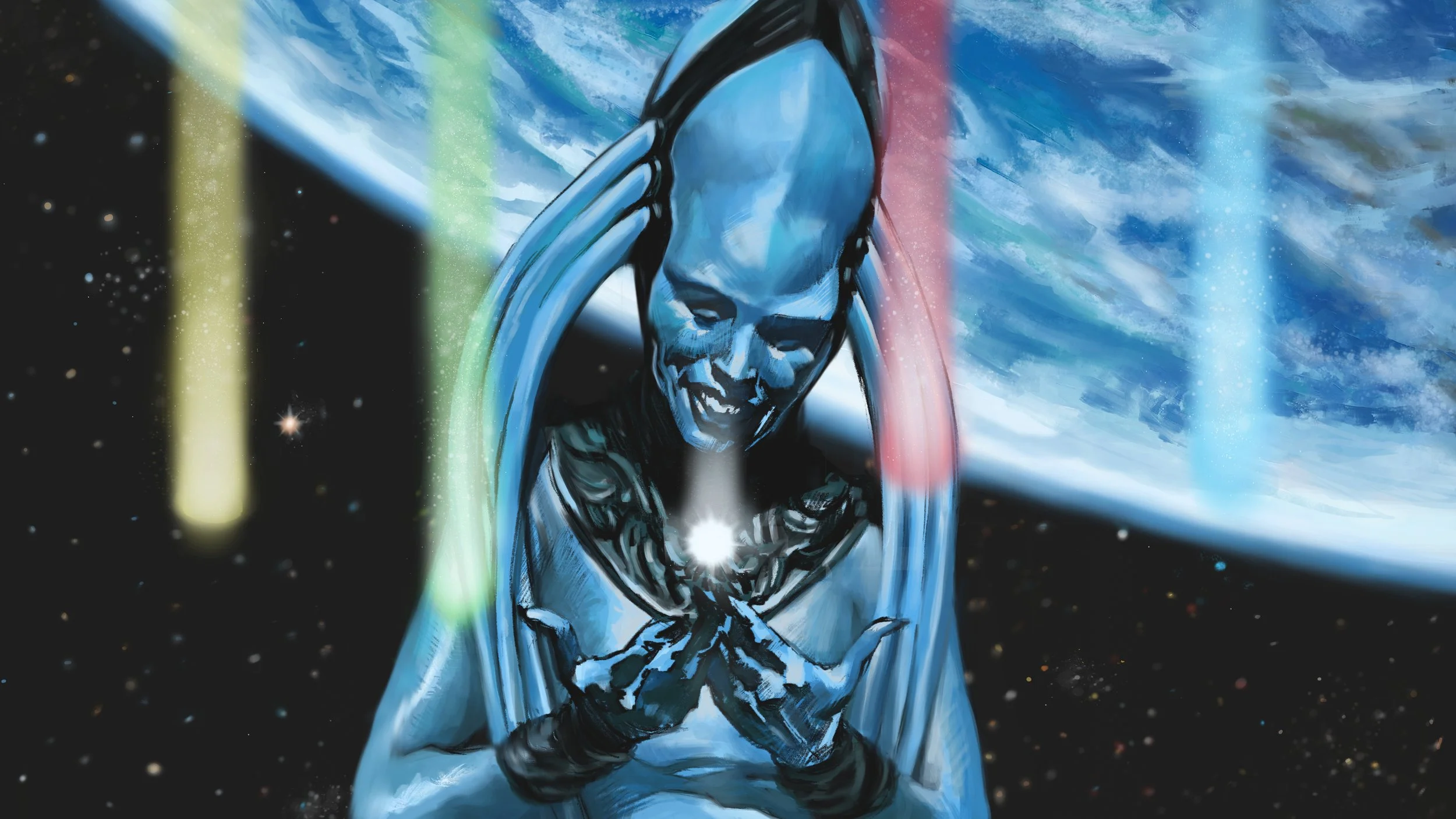
No Wild and Abberant Star
Written by Riley Womack
Digital Painting
Note from my art director was clear. Go all out. And so that was a challenge. What the hell does my all out effort look like? I began questioning my abilities. Am I even good enough? I’m sure I have more to learn. I’m somewhat academically trained and have been drawing all my life so I have some experience to draw from. But I always struggle between finding simplicity vs painting something to death. And even then things sometimes end up looking inadequate.